Smaller projects
Over the years, I’ve worked on a variety of smaller designs: posters, flyers, and other creative pieces that didn’t need a full page of their own but still deserve a place in my portfolio.
Promoting P&E
I’m a volunteer for nautical scouting Paltz & Eemgeuzen. To support the group, I designed a flyer to help attract new members who want to make new friends and learn how to sail along the way.
Additionally, I created a logo that doubles as a uniform badge for the volunteers, known as "ploeters" - a Dutch term meaning “hard workers.” The name pays tribute to a former tugboat, De Ploeter, that was once part of the fleet. It symbolizes how volunteers help keep the organization afloat, much like the boat that towed others through the water.
Posters and coasters
Know U is a project I created for UUT, an initiative of the Dutch National Youth Council (NJR). UUT works with young people from Utrecht to provide a platform where they can share their voices and advise the Utrecht municipality on key issues like mental health, integration, and education.
The concept behind Know U is the organisation of monthly pub quizzes held in different districts of Utrecht. These quizzes are a way for local youth to connect, while also giving them a chance to share their thoughts on important issues. Between trivia questions, statements are shown related to issues that matter to the community. Players can write down their opinions on special coasters and submit them afterward, offering a way to share their stories and experiences about living in Utrecht.
Designing a mascot
At my internship at UW-S I was tasked with designing a new mascot for their product line called KidsClub; a line of in-store childrens entertainment products. The KidsClub consists of small shopping carts with screens and a charging station, a touch wall and a gaming station with integrated screens.
The end result is a carrot named Pluk, who came to life using a combination of both clay and illustration. Pluk the Carrot is an ambassador for making smart food choices and living a healthy life.
Birth announcements
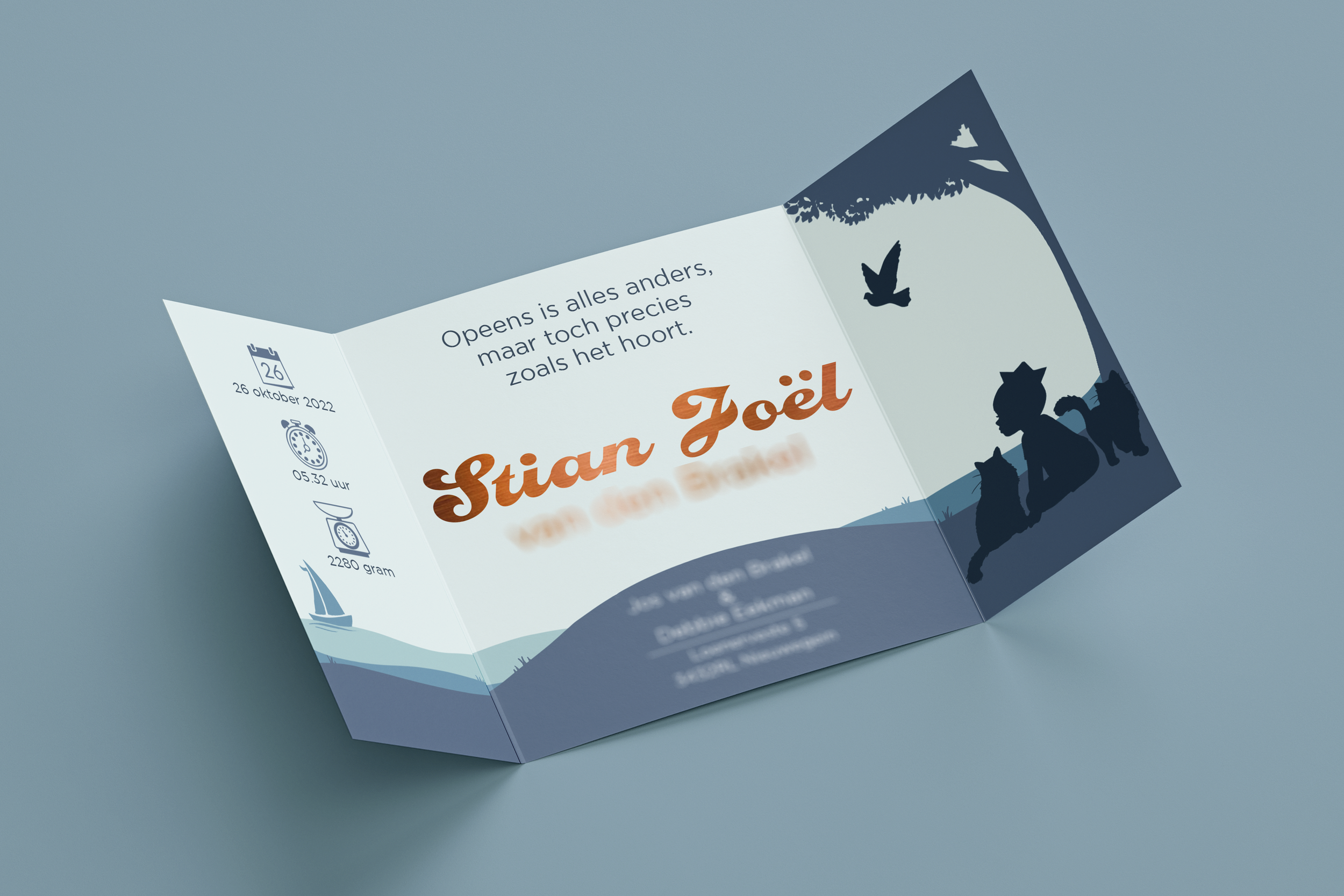
When I was asked by soon-to-be parents to design their birth announcement card, my priority was to honor their style and make a card that’s fully personal to them. The result is a gatefold card featuring silhouette-style artwork and bronze foil-stamped lettering.
The parents wanted the front of the card to include a car so I used that as a starting point to tell a bit of a story. Accompanied by mom’s two Maine Coon cats and being shown the way by dad’s racing pigeons, their new son starts his journey.The small sailboat on the inside of the card serves as a nod to the boy’s late maternal grandfather.
When asked to design a card for the couple’s second child, it was important to maintain a sense of continuity. I wanted both cards to tell a shared story while still allowing them to stand on their own. I incorporated recurring imagery and themes to connect both cards.
I wanted the focal point of the card to be on the relationship between the two siblings. The new doughter looks up to her brother for guidence, while he helps her to navigate.
What I appreciate about this card is how it showcases my growth in both illustration and design. With 1.5 years between the two projects, I can see how much more confident I’ve become working in a style that used to feel outside my comfort zone.


